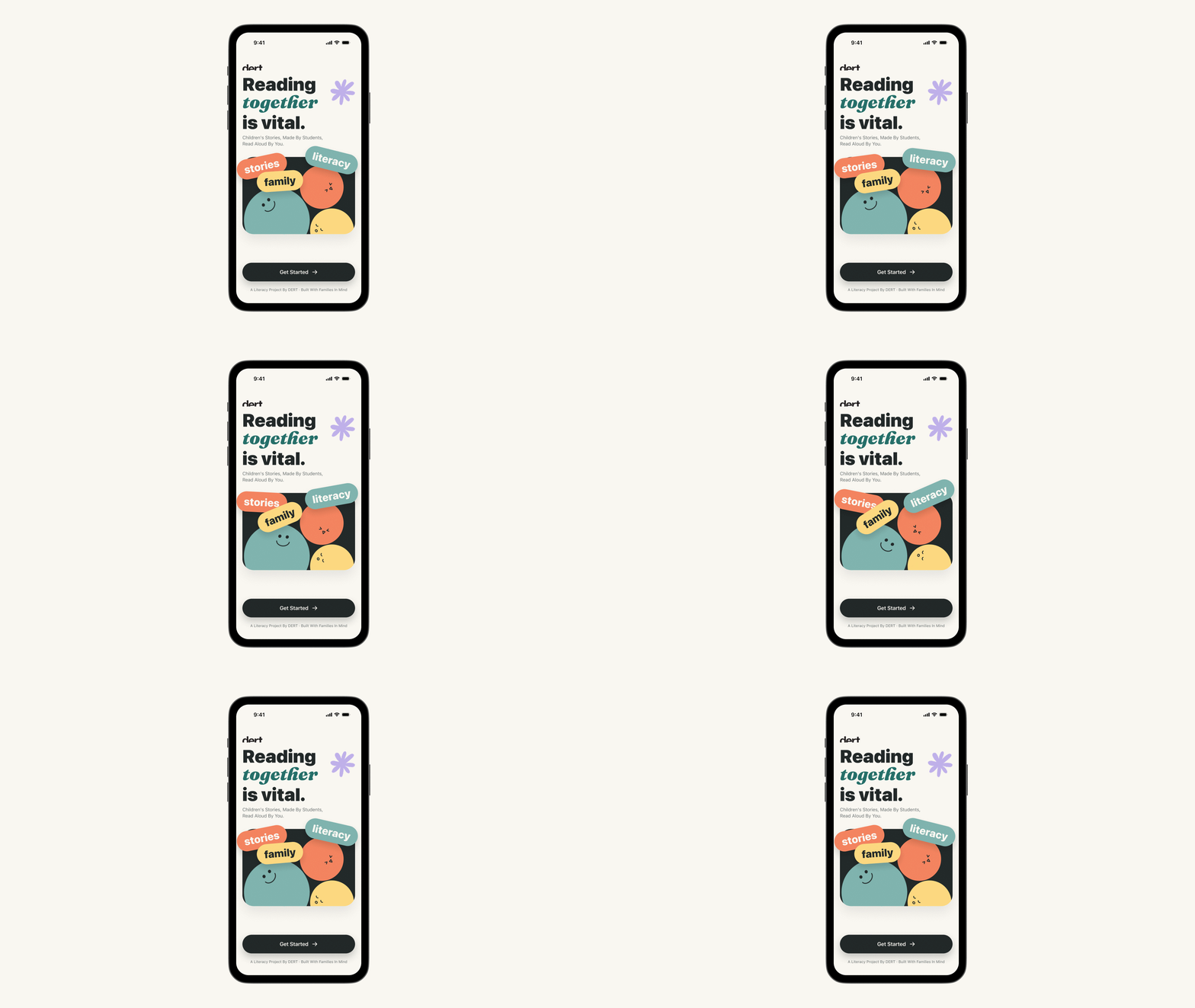
DERT Reads Landing Page

DERT
READS

A two-sided literacy ecosystem reimagining how children read aloud โ€” with families, with mascots, with student-authors. Built solo, end-to-end.

ClientDERT, literacy nonprofit (Parsons partnership)
RoleSolo product designer & front-end engineer
TimelineSpring 2026 โ€” ongoing (WIP)
ServicesProduct strategy / IA / Brand / UI / Motion / Engineering / Tools
StackReact, TypeScript, Vite, Framer Motion, Vercel
01
Overview
01Overview
The Challenge

Scale vs. Authenticity

When I describe DERT Reads, people sometimes call it "an audiobook with a transcript." That comparison is the fastest way to misread the entire product. Audiobooks treat children as passive listeners. DERT treats them as co-performers โ€” and, eventually, as authors.

The founder of DERT, a literacy nonprofit partnered with Parsons, asked me one question that reshaped the product: How do we build a digital product that protects the human side of reading, instead of replacing it? The tension between scale and authenticity became the through-line.
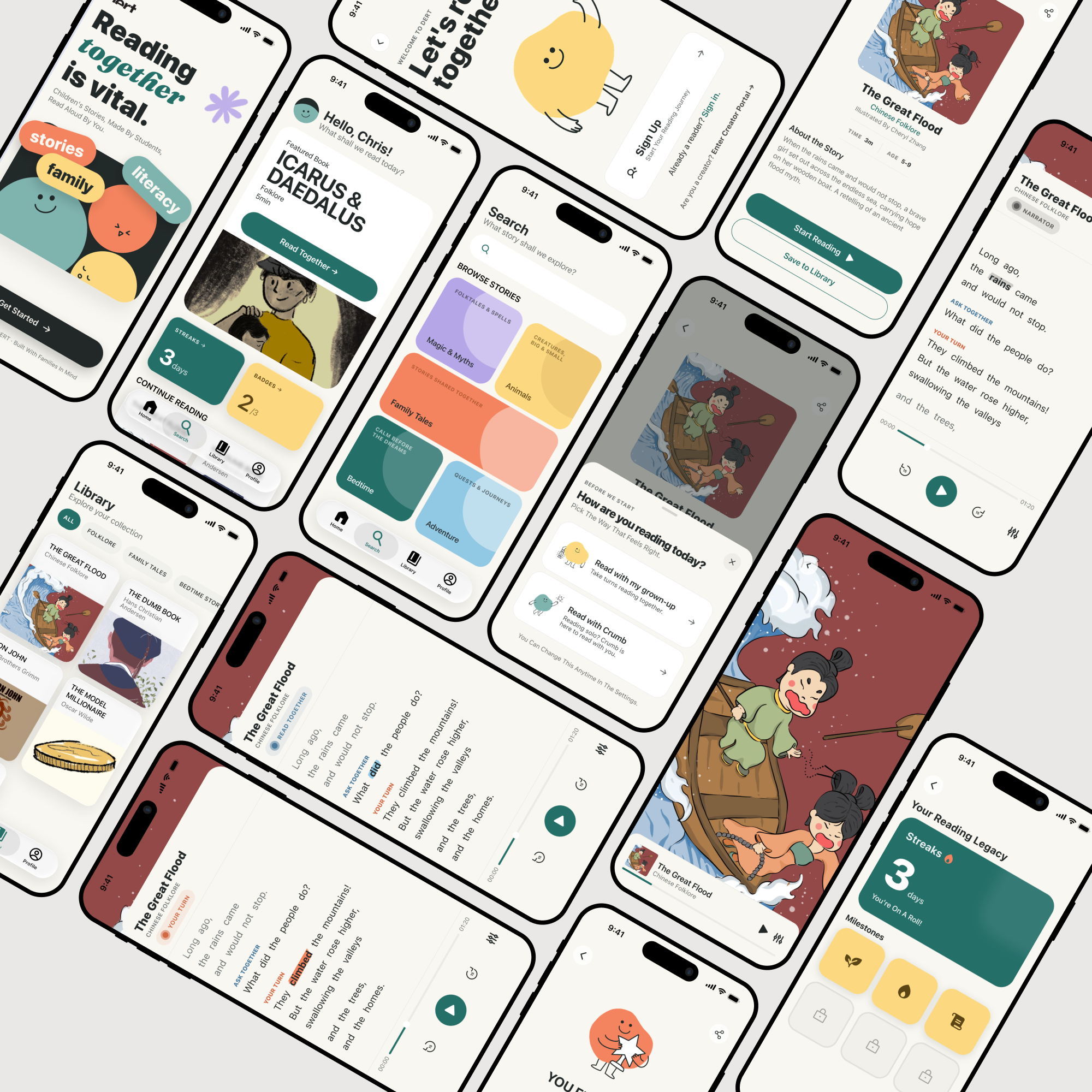
Side-by-side โ€” Audible/Storytel screenshot vs DERT Play screen with 3-color speaker tags

Audiobook โ‰  Co-reading. One is consumption; the other is performance.

The Approach

A Four-Actor Ecosystem

I designed DERT as a four-actor ecosystem, not a single app. The platform connects content authors directly to readers, with editorial review as the moderation layer. A nonprofit funded by a school becomes a moderated publishing house staffed by the school.

  • CHILD READER (5โ€“10) โ€” reads aloud when it's their turn; not a viewer
  • CO-READER โ€” (parent / sibling / Crumb in solo mode) reads opposite turns
  • STUDENT AUTHOR โ€” (Parsons design students) builds original books
  • PROFESSOR โ€” editorial gatekeeper, curates the published library
4-actor diagram with arrows showing content flow
Architecture

Information Architecture

Current stage: 12 surfaces across two sides. Every screen designed mobile-first; every component shipped in React/TypeScript.

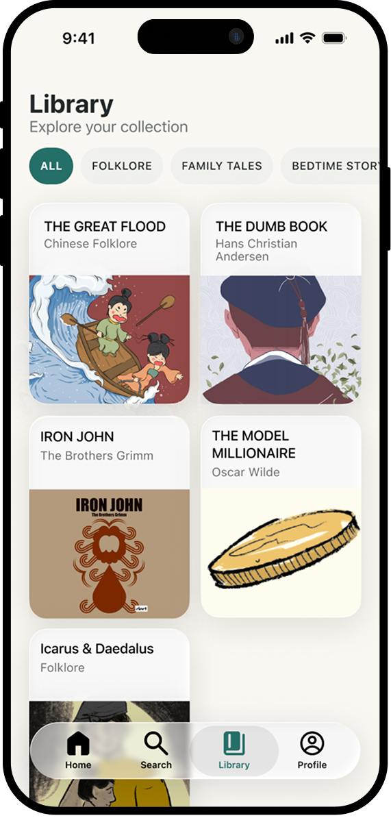
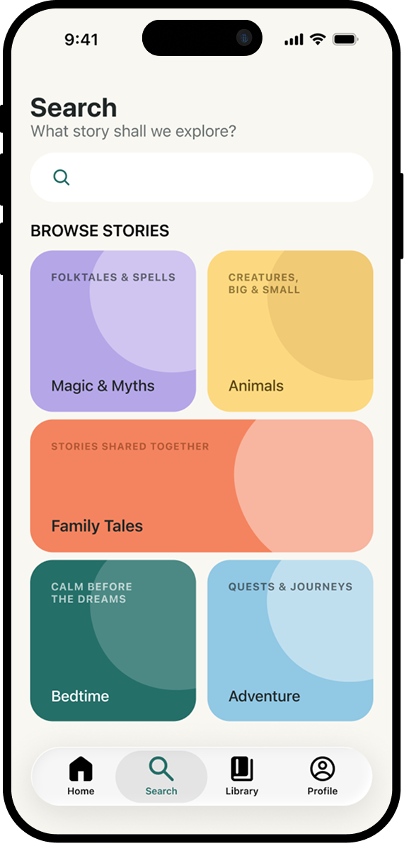
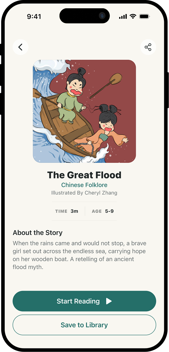
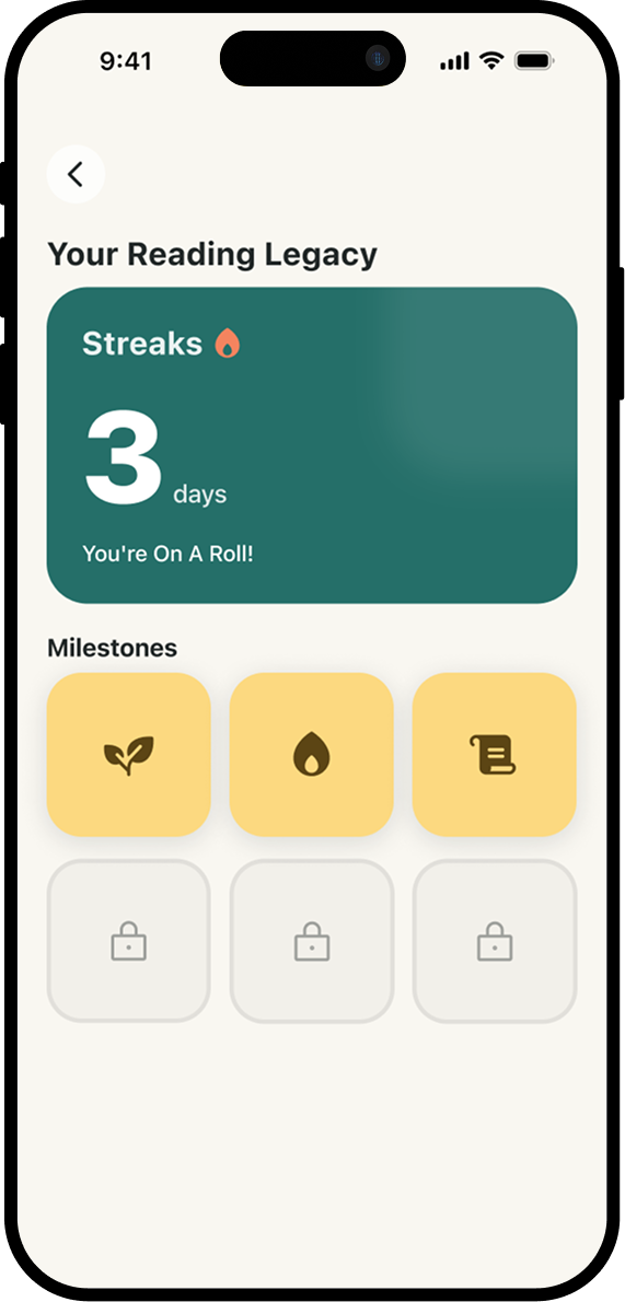
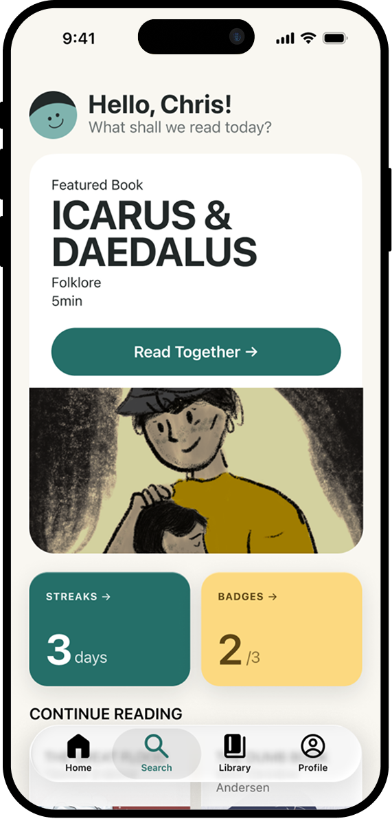
  • C-side (Family): Landing ยท Start ยท Sign-in ยท Home ยท Library ยท Detail ยท Reading Mode Sheet ยท Play ยท Mini Player ยท Completion ยท Achievements ยท Profile
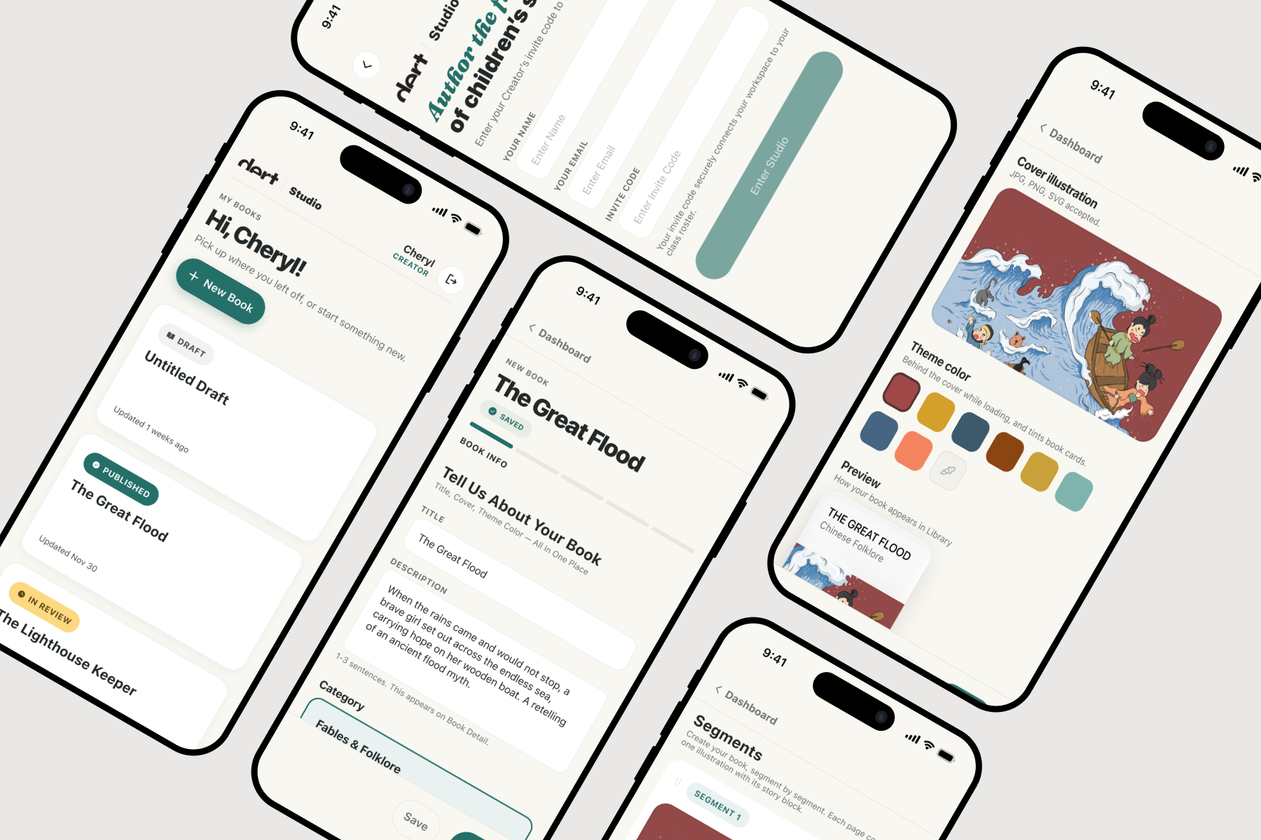
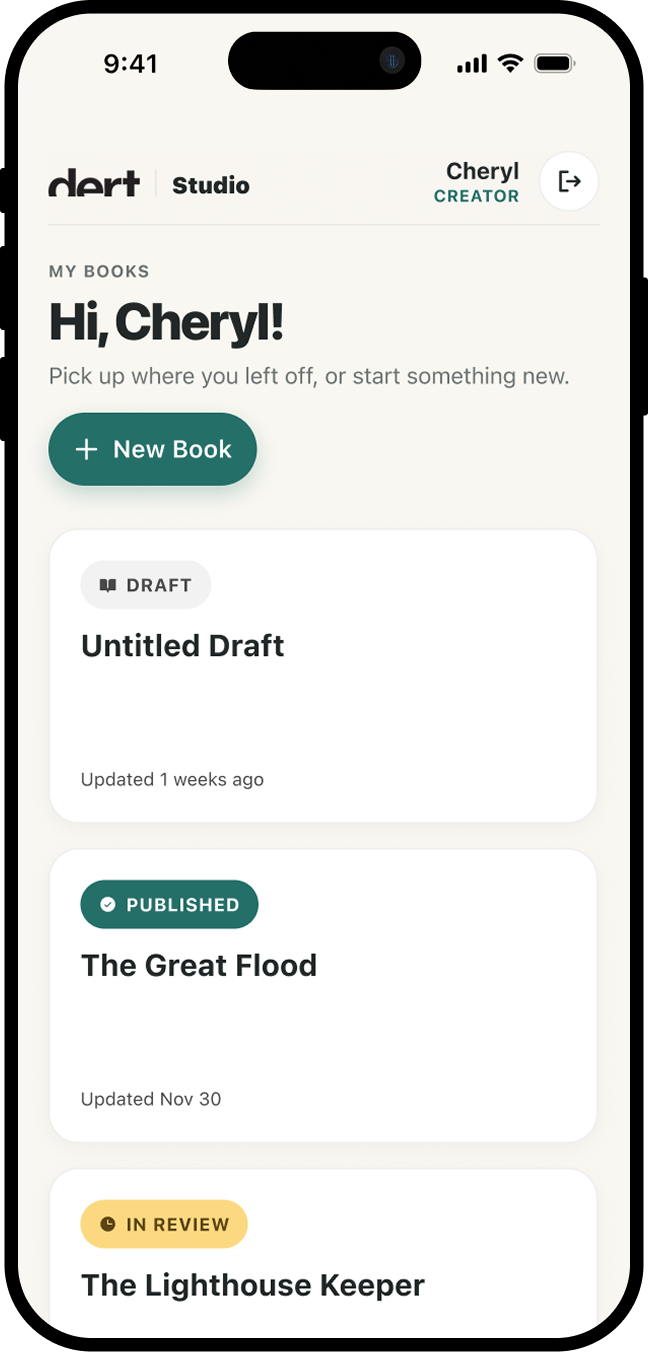
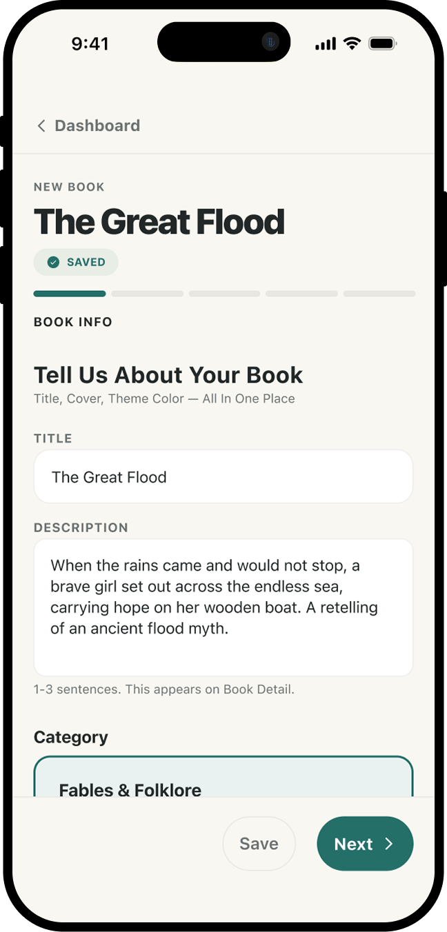
  • B-side (Studio): Login ยท Dashboard ยท 5-step Editor wizard (Book Info / Pages / Hotspots / Audio / Review)
Sitemap / surface inventory
Visual System

Hue Ladder & Speaker Colors

The brand sits intentionally between Apple-HIG polish and hand-drawn warmth. Not a sterile productivity app pretending to be for kids. Not a kids' app drowning in primary colors. A good book on a phone.

Hue ladder โ€” one teal family, four deliberate stops: brandPrimary (chrome, CTAs) โ†’ brandSage (mascot, accent surfaces) โ†’ brandTertiary (dividers) โ†’ brandSurface (tint).

Speaker color system โ€” every speaker has two color slots, designed as two stops on the same hue axis. Solid label for caption text (deep tint), wash PNG for the brushstroke painted behind the active word (light tint). One color can't do both jobs well; the hue ladder solves it.

Brand system board โ€” hue ladder + speaker SOLID/WASH pairs
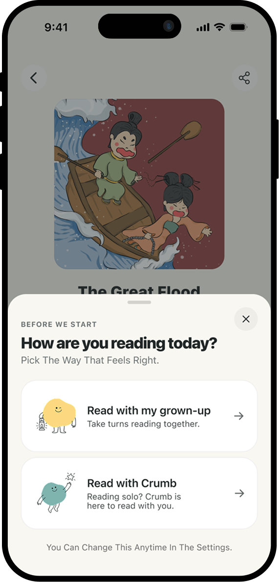
Reading Mode Sheet โ€” Family vs Solo cards, Crumb visible on Solo
UX Logic

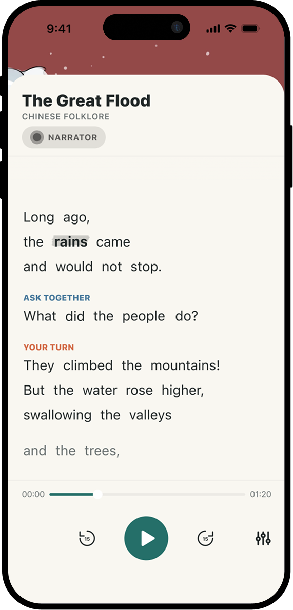
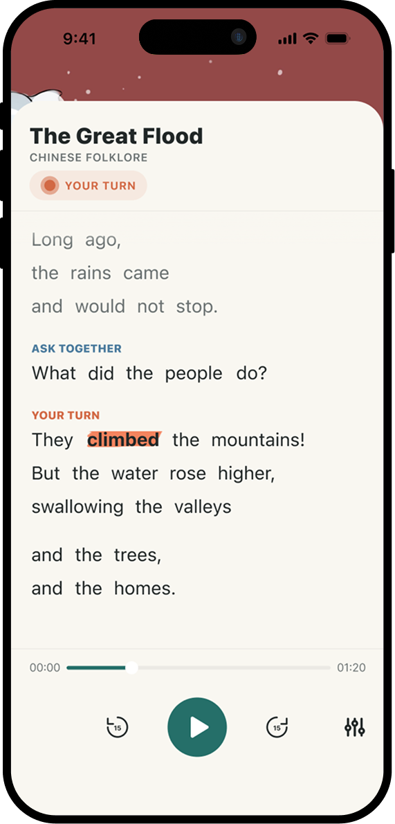
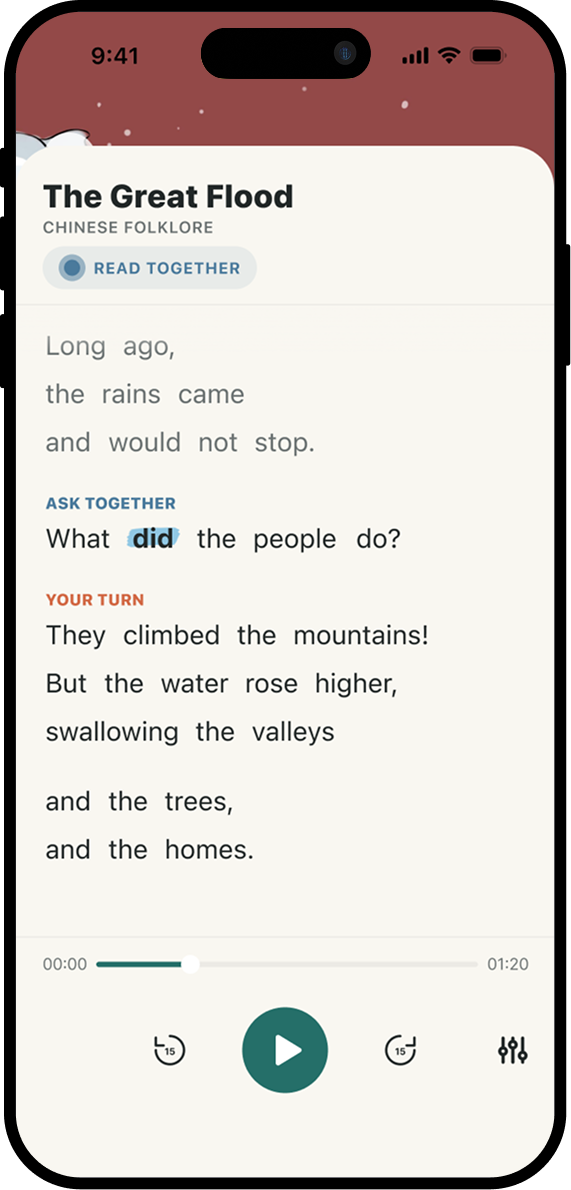
Three-Color Speaker Model

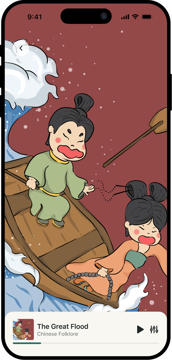
Narrator (gray), Parent (deep powder blue), Child (deep coral). The current word highlights with a wash PNG painted behind it. A 6-year-old can see who reads what โ€” no quiz, no prompt, just typography.

This wasn't a visual decision; it was a literacy decision. Most read-aloud apps highlight the current word but don't tag the speaker โ€” the child has no visual cue when their turn arrives. The three-color system makes the co-reading turn-taking visible.

Play screen with 'What did the people do?' highlighted, parent pillPlay screen with 'They climbed the mountains!' highlighted, child pill
Inclusivity

Inclusive Mode & The Crumb Decision

Halfway through the project, my advisor pointed out: not every kid has a parent at bedtime. The product would fail equity if it required two voices to function. So I added a companion mascot, Crumb. It took three iterations to get it right.

  • v1: Crumb floating bottom-right on book illustration. Cute. Competed with hand-drawn book art for attention every second the child tried to read.
  • v2: Crumb embedded in sheet header as 40px avatar. Too tiny to read personality. Still added chrome to active UI.
  • v3: Crumb removed from active reading entirely.

The right pattern came from studying Headspace. Their mascots live in moments and cards. But never in the active meditation interface. In active reading, Crumb's presence is communicated verbally โ€” "CRUMB ASKS" as the speaker label triggers the mental model of "Crumb is my reading partner" without any visual reinforcement.

"A reading app's UI doesn't need a mascot. It needs a clean page and a friend who shows up when it matters."
Crumb v1 with X markCrumb v2 with X markCrumb v3 with โœ“ mark
UX Writing

Inclusive UX Writing

Original CTA: "Read with your grown-up."
Revised CTA: "Take turns reading together."

The change took 30 seconds. The product implication was structural: no assumption about family structure (caregivers, older siblings, foster parents all welcome), no shame for kids reading alone, and the language now describes the actual interaction โ€” turn-taking, not adult-led reading.

Interactions

Reader Sheet โ€” Four States

Full / half / peek / mini player. Children can drag the reader down to a 90px bottom bar and keep listening while a parent finishes dinner. The iOS music app pattern, applied to children's content.

4-state sheet diagram
Motion

Completion Screen

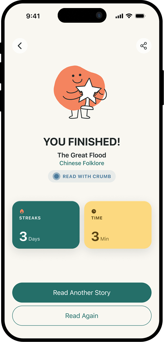
When the last word is read, a celebration overlay slides up. Crumb appears LARGE here (180px holding a star) because this is a moment, not active work. Stats trio: streak / time / read-with. Stagger animation: Crumb bounces in, headline slides up, stats cascade, CTAs settle.

Completion screen
Studio Editor โ€” multi-segment drag-drop in action
Creator Studio

Three Users, Three Different Mental Models

The Studio serves student-authors building books and professors reviewing and curating them. Each persona has a different mental model:

ActorNeeds
Student AuthorA wizard that doesn't feel like a CMS. Real-time visual feedback. Drag-and-drop authoring.
ProfessorClass roster, review queue, publish/reject controls, engagement metrics.
Workflow

Wizard Architecture: 7 โ†’ 5 Steps

The original wizard had seven steps: Basics, Cover, Pages, Hotspots, Audio, Preview, Submit. Two merges emerged from thinking about the type of work in each step:

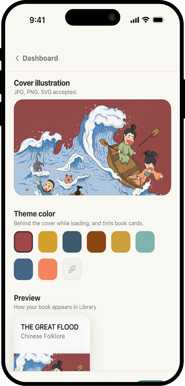
Basics + Cover โ†’ Book Info. Both are metadata about the same object. Combined with a Live Preview card that updates as the author types, they become one composition surface.

Preview + Submit โ†’ Review. Submit isn't a step; it's an action. Merged into a Review screen with an iPhone-frame preview of the full reading experience and a sticky Submit bar.

What I deliberately did not merge: Pages and Hotspots. They share a surface but represent two different mental modes โ€” creation versus polish. Student-authors want to finish the manuscript before decorating it with interactivity.

Wizard progress bar โ€” 5 thin segments + BOOK INFO label
Layout

Asymmetric Sticky Layout

On desktop the Book Info step is a 60/40 split โ€” form on the left, sticky live preview card on the right. As the author scrolls through metadata, the preview stays pinned, showing the book card exactly as it will appear in the Library.

Engineering note: CSS Grid plus `align-items: start` breaks sticky because the grid cell auto-sizes to content height. Switched to Flex with `align-items: flex-start` to let the preview pin to the page scroll.

Two-column layout โ€” form left, sticky preview right
Data Model

Multi-Segment Per Page

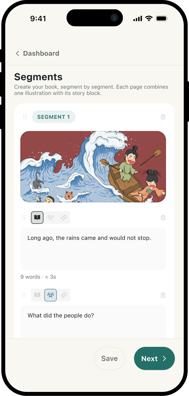
First pass shipped one-speaker-per-page. PM critique: real children's stories have multi-turn dialogue within a single page. Narrator opens the scene, parent asks a question, child answers.

"A page is a visual unit, not a speaking unit."

Refactored the data model to an ordered segment list, matching the production rendering structure 1:1. Authors now build pages the same way readers experience them.

Page card with 3 draggable segments + speaker icons
Interactions

Drag-and-Drop Authoring

Reordering pages and dialogue segments was originally Up/Down arrow buttons โ€” visual noise, no signal for "this is reorderable." Replaced with `framer-motion`'s Reorder system and a DotsSix grip handle (44pt target on mobile) using `touchAction: none` to prevent scroll conflict during touch drag.

Drag interaction GIF
Engineering

Mobile-First Fluid Layout

Inline styles can't use CSS media queries, so I wrote a `useIsMobile` hook (matchMedia, 600px breakpoint). Page cards on mobile lose their shadow + border + extra padding โ€” the card "dissolves" into the canvas. Three-button bottom nav becomes a Primary Stack pattern.

Design System

Color System Articulation

When the Crumb mascot color (`#7FB3AE` sage) didn't match the brand primary (`#256F69` deep teal), the first instinct was to "fix the mismatch." The actual answer: industry pattern. Duolingo's Duo and Mailchimp's Freddie both sit one tier softer than their brand chrome. CTAs need contrast punch; mascots need approachable warmth. Same hue, different jobs.

Implementation

Safe-Area-Inset Everywhere

iOS Safari with `viewport-fit=cover` puts content edge-to-edge, including under the status bar. Hardcoded `paddingTop: 70` produced too much gap on newer models. Switched all top paddings to `calc(env(safe-area-inset-top, 0px) + 8px)` for consistent rendering across every iPhone model.

Voice upload mock or quote card on cream bg
Vision

Voice Upload, Not AI Voiceover

The next sprint is voice recording. A parent records themselves reading the book. A student-author records their own story in their own voice. We won't offer AI voiceover.

This is the most important product decision I'll make on DERT, and the one most at odds with where the market is going. In a children's literacy app in 2026, the human voice isn't a feature. It's the product. The founder's principle of authenticity isn't a marketing tagline โ€” it's an architectural commitment that has to be defended at every fork.

Roadmap & Outcomes

Outcome: The Constraint Was The Feature

Twelve surfaces shipped. One person. End-to-end. Research, IA, brand system, UI, motion, React/TypeScript, Vercel deploy. Every animation tuned by hand in framer-motion.

The project's most uncomfortable lesson: the constraint was the feature. The Universal Hotspot Protocol exists because student-authors can't code. The Inclusive Mode exists because not every kid has a parent. I'm a product designer because I get to make those constraints visible โ€” and then make them lovely.

Key Deliverables

  • Two-sided platform (12 surfaces, C-side + B-side)
  • Brand system with documented hue ladder + speaker color system
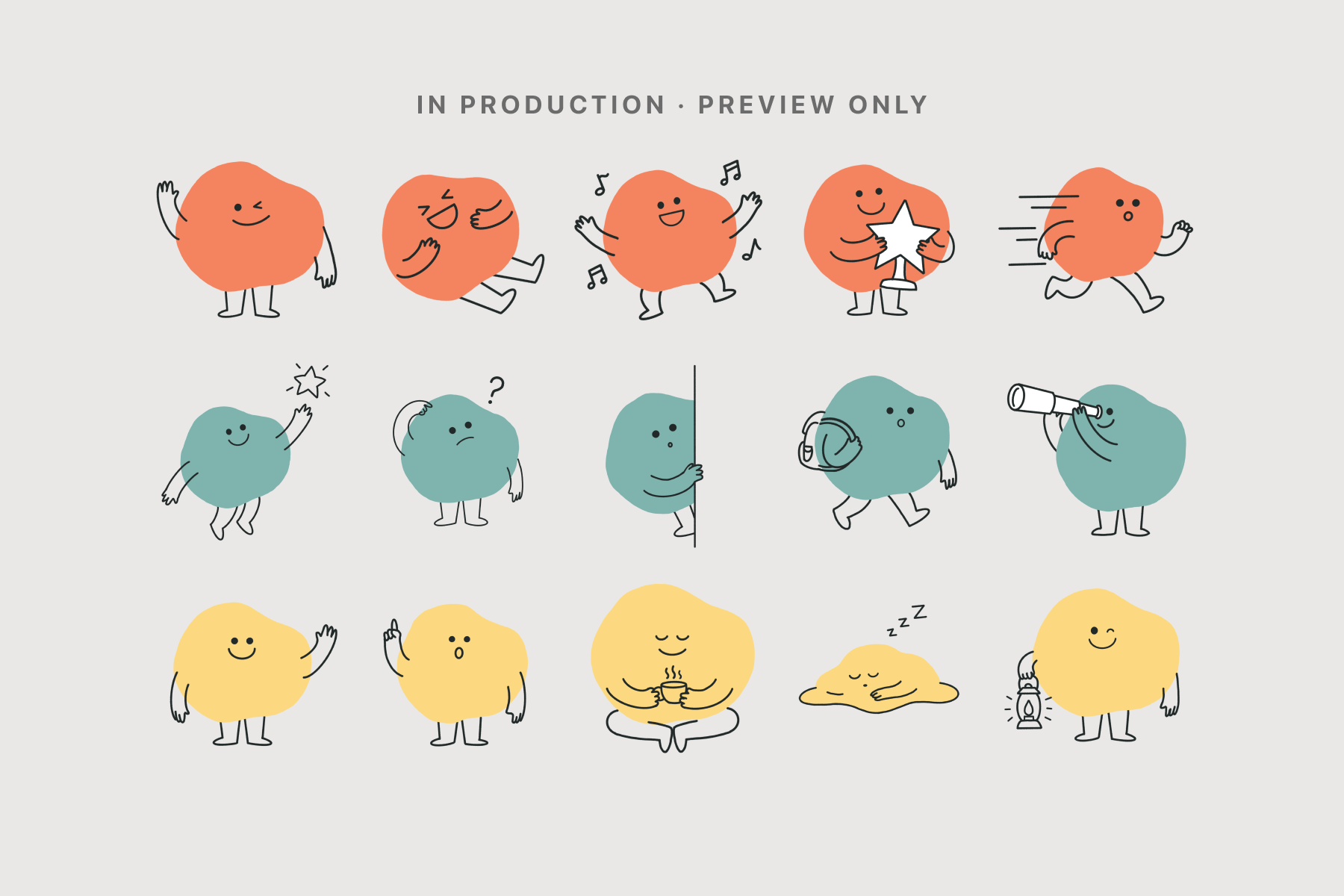
  • Mascot library (3 color families ร— 5 pose variants = 15 PNGs)
  • Editor wizard with live preview + drag-drop multi-segment authoring
  • Mobile-first fluid layout system + safe-area-inset compliance
  • Full React/TypeScript codebase, deployed on Vercel

Upcoming Roadmap

  • Stage 4: Universal Hotspot Protocol (no-code interactive moments)
  • Stage 5: Voice upload (parent + student author voices)
  • Stage 6: Professor curation tools (review queue, class metrics, approval workflow)
  • Stage 7: Supabase backend (auth, content storage, real publishing)
Next Project
SANVO ECOSYSTEM
โ†’