PetEase
Pet Service Information Hub
Role: User Interface Designer, User Researcher
Duration: March - May 2021
Scope: User Research & Testing, Interface Design

About
PetEase was created with the aim of providing pet owners in North America with an efficient way to access multiple pet-related platforms. The app was designed to serve as a hub, consolidating various pet-related services such as vet clinics, pharmacies, and pet stores. By providing a centralized platform, users can easily allocate information to other clinics and access guides and shops, including pharmacies. The app is targeted toward pet owners residing in North America.
Research
My team and I conducted semi-structured interviews among 11 pet owners who are currently located in North America (Canada and the United States) to learn about their daily routines and concerns regarding pet care. Some of the questions we asked include:
How much money does the interviewee spend on their pet monthly and how do they feel about the number (Is it too much? Is it a reasonable amount?)
What are the common pet care items that the interviewee purchase every month? (ex. Food, litter, toys, medication)
Describe the daily routine of taking care of their pet(s).
Does taking care of their pet(s) make the interviewees feel overwhelmed? Why?
What is the most stressful part of taking care of their pet(s) from their own experience?
Do the interviewees use any pet care platforms/apps to help the pet care routines? Why do they consider it helpful?
If the interviewees abandon a previously used pet care platform, what was the reason behind it?
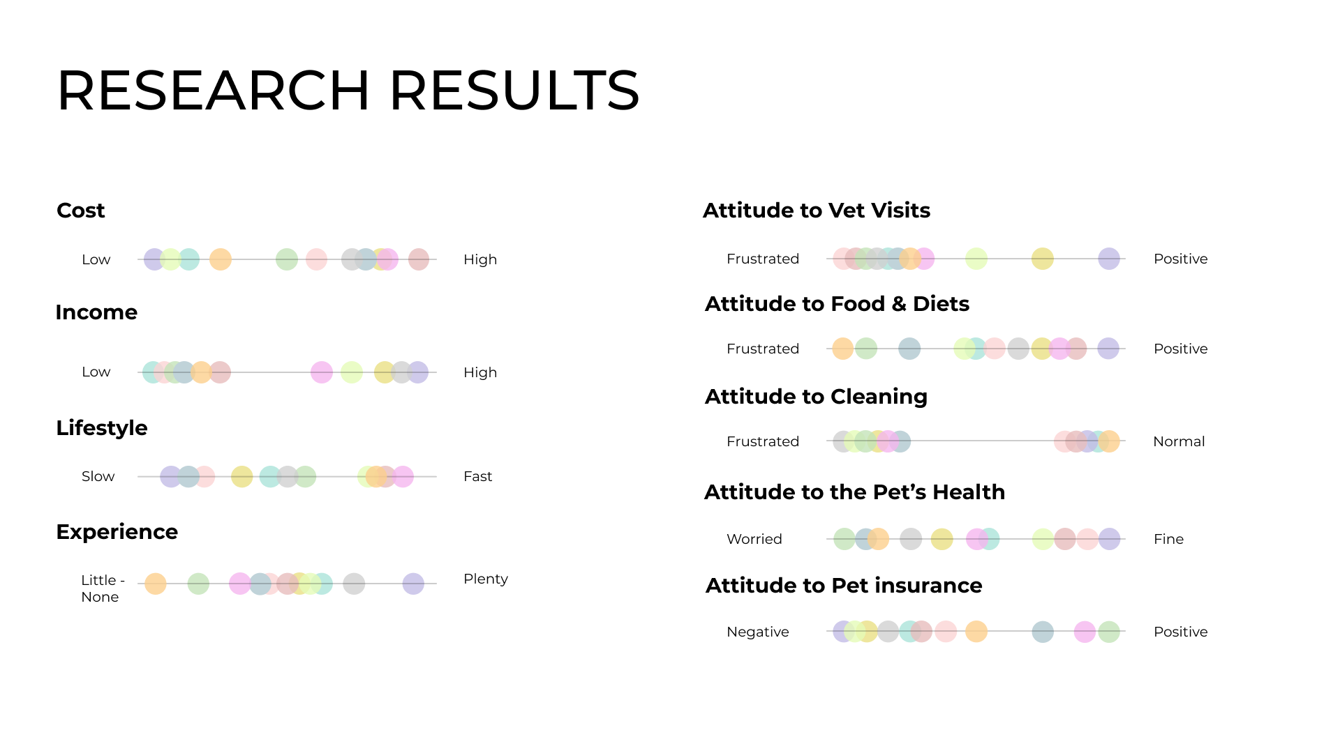
We also organized the interviews into 3 main takeaways to identify the common issues and concerns among the interviewees:
The interviewees often take a long time to learn knowledge regarding pet care because the information is all over the place (ex. Some interviewees rely on Google, yet Google contains some false information; some others rely on vets, yet it takes a while for their vets to respond).
The cost of pet care is quite expensive (ex. Medical expenses, pet insurance), or the money spent on certain items are not worth it (ex. The pet doesn’t like the food/toy that the owner buys; discovering that the pet insurance was not necessary because the pet is indoor only).
There are a lot of files and accounts to keep (ex. Health-related files are often printed unless the owner requests a digital file; if the owners relocate, they have to ask the previous clinic to send their pet’s file to the new clinic, which takes a lot of time), and they are often sent from different places (ex. Animal hospitals, medical suppliers, pet stores).
After organizing the answers, we created a chart that helps us to identify the issues.
User Persona
After analyzing the results from the interviews, we created 3 user personas to represent the potential users for the platform.

Competitive Analysis
We conducted research on pet care apps and platforms that are currently or potentially competitors in the market. We identified and assessed the strengths and weaknesses of each platform. We classified them into 3 categories:
Medical suppliers
Pet item suppliers
Others (Planners, information gatherers)

Idealization & Wireframing
After completing the research, we began to dig into the interface design of the app.

Low-Fidelity Wireframes
Mid-Fidelity Wireframes (after user feedback)
Mid-Fidelity Wireframes (Initial)
After completing the initial mid-fidelity wireframes, we presented them to the users and gathered information after they tested them out. We summarized 6 points from the user feedback to help us revise the wireframes before progressing to high-fidelity wireframes:
The layouts and colors of the app could be more dynamic.
The message behind the app icon was not clear. It should be more intuitive.
The phrasings for some of the frames could be changed and revised so the users could have a better understanding.
A calendar feature for booking events could optimize the user flow.
Decide on the overall user flow of the app (fewer layers = more minimal; more layers = friendlier)
There were 2 navigation bars (top & bottom), and one of them should be taken out in order to optimize flow.


User Flowchart

Style Guides


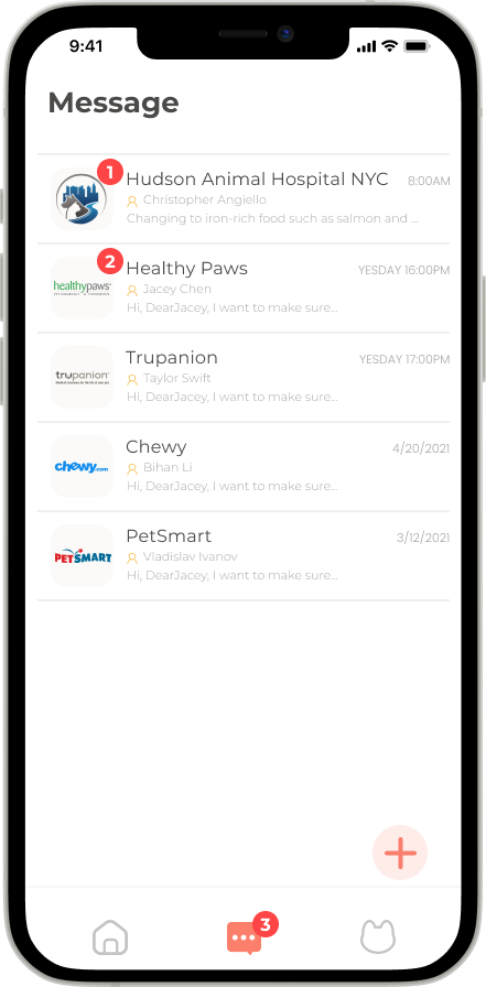
High-Fidelity Wireframes