SANVO Art Direction Hero

SANVO
ART DIRECTION

An editorial art direction and campaign photography series for an HKEX-listed chemical manufacturer — four distinct visual worlds across 20 product shots, reframing industrial chemicals as objects worth wanting.

ClientSANVO Fine Chemicals (HKEX: 0301.HK)
RoleCreative & Art Director
Timeline2026
ServicesArt Direction, Photography Production, Brand Visual System
TeamPhotographer: Peng Lv, AcidStudio
01
Overview
01Overview
Background

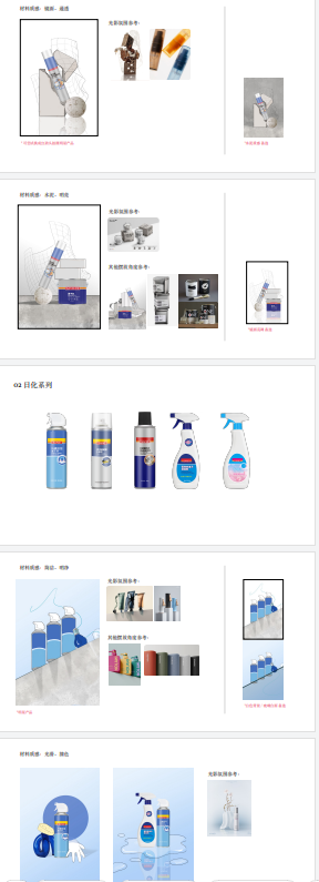
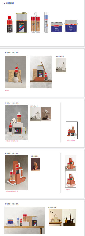
Industrial Identity vs. Premium Precision

SANVO Fine Chemicals is a Chinese manufacturing brand preparing for North American market entry in 2026. The challenge: an industry defaulting to aggressive, catalog-style product marketing — and a brand that needed to signal precision, premium quality, and global credibility without losing its industrial identity.

The Brief

Objects Worth Wanting

How do you make industrial chemicals look like objects worth wanting? The answer wasn't to hide what the products are — it was to reframe them, treating each product as a modern sculpture and each series as its own visual world with distinct material language, lighting logic, and emotional register.

I led the complete creative and production process across four product series — developing the visual concept, writing the creative brief, selecting and directing the photographer, overseeing on-set composition and lighting, and reviewing final selects in post.

SANVO Overview

Reframing industrial products as modern sculptures.

Series 01

Construction: Industrial Sculpture

Concrete · Hard light · Geometric tension. Products treated as architectural forms — stacked, leaning, suspended — to communicate structural precision. Hard side-lighting carves shadow lines across metal surfaces, referencing brutalist architecture.

Construction Series7 shots
Construction 01
Construction 02Construction 03Construction 04
Construction 05Construction 06Construction 07
Series 02

Household: Suspended Purity

Powder blue · Soft diffusion · Laboratory clarity. A monochromatic blue world built on clean geometry and unexpected prop tension — tilted spray bottles balanced on stacked blocks, coiled tubing as a visual thread. The goal: make everyday cleaning products feel like precision instruments.

Household Series5 shots
Household 01
Household 02Household 03
Household 04Household 05
Series 03

E-commerce: Trendy DIY

Cardboard · Colored tape · Warm natural light. Targeted at Gen Z buyers on Chinese e-commerce platforms. Props sourced from the DIY world — wooden ladders, cardboard furniture, washi tape — to build a visual language of creative repair culture rather than utility.

E-commerce Series4 shots
E-commerce 01E-commerce 02
E-commerce 03E-commerce 04
Series 04

Automotive: Garage Noir

Black · Spotlight · Curated chaos. The darkest series. Deep black backgrounds, hard spotlight, products arranged with deliberate disorder — the aesthetic of a garage after real work has been done. Red is the only punctuation.

Automotive Series4 shots
Automotive 01
Automotive 02Automotive 03Automotive 04
Execution

Creative Direction Decisions

  • Established the "Swiss-Red" color system on set — pairing SANVO's brand red with cool industrial grays and blacks across all four series for brand cohesion while allowing each its own visual register.
  • Directed all prop selection and on-set composition to ensure each product's physical form was treated as a sculptural element rather than a catalog object.
  • Briefed and directed photographer [AcidStudio] on lighting approach per series: hard spotlight for Automotive and Construction; soft diffusion for Household; natural warm light for E-commerce.
  • Final assets deployed across the WeChat campaign and new official company website (currently in deployment).
Art Direction Ref 01Art Direction Ref 02
Art Direction Ref 03Art Direction Ref 04
SANVO Final Campaign
Next Project
AURORA SERIES